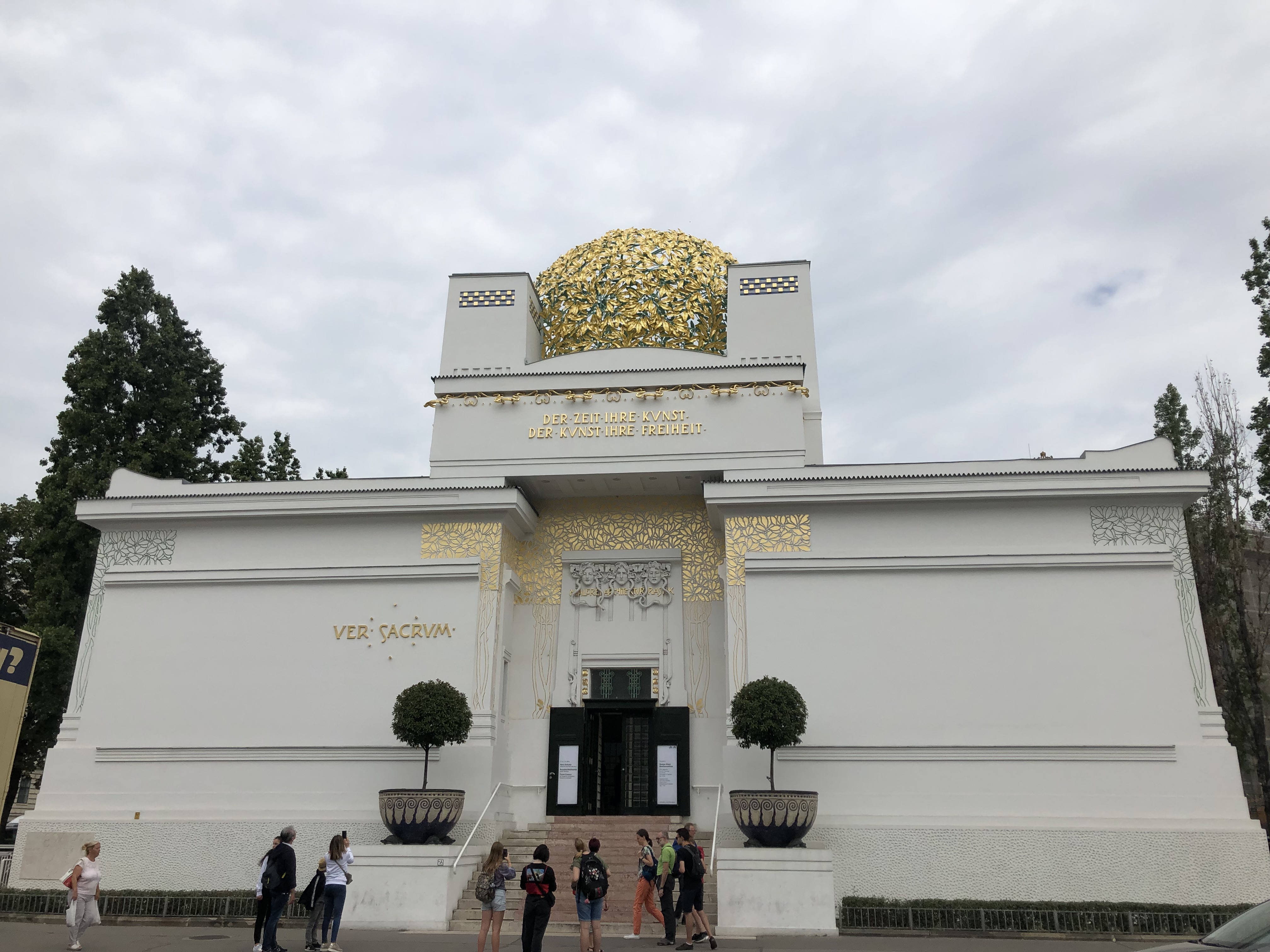
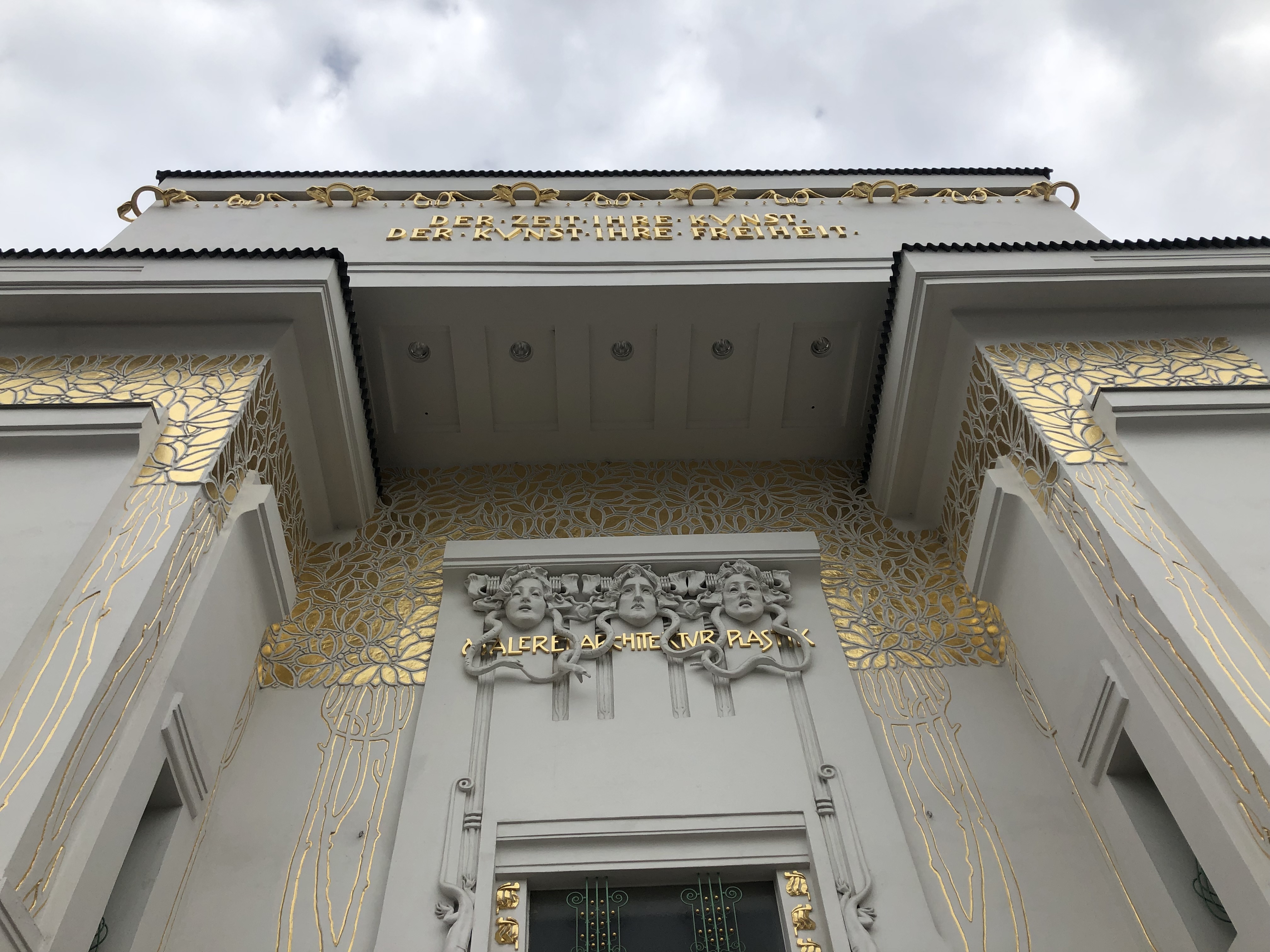
Walking on the street, I noticed the secession building from down the street and admired it with awe as we approached. I noticed that the building stood out against the rest of them, it immediately caught my eye. The gold leaf detailing and Medusa’s heads on top of the doorway led me to believe that it was inspired by ancient Greece. I thought that it was a unique choice of décor that I hadn’t seen on any other buildings, and it made me wonder if Klimt enjoyed studying Greek mythology. I noticed that the building was also very simplistic, this is the first building that I have noticed that is not entirely intricately decorated. Interestingly, the color scheme of the imperial palaces that have been previously grabbing my attention (the white, teal, and gold) was not displayed on the outside of this building.
The inside of the museum was no less astonishing than the outside of the museum. We first went into a blank, white room. I remember that it felt weird to be in such a clear space, because I have not been in this plain of a room yet during our exploration of Vienna. It felt refreshing to have the open space and the soft light coming in through the windows. The room only had paintings hanging on the wall, no other ornate decoration. There were two paintings on the wall that particularly stood out to me. The first was a painting of a red wine cup, and the second was one of two horse heads sticking out of a gold goblet.
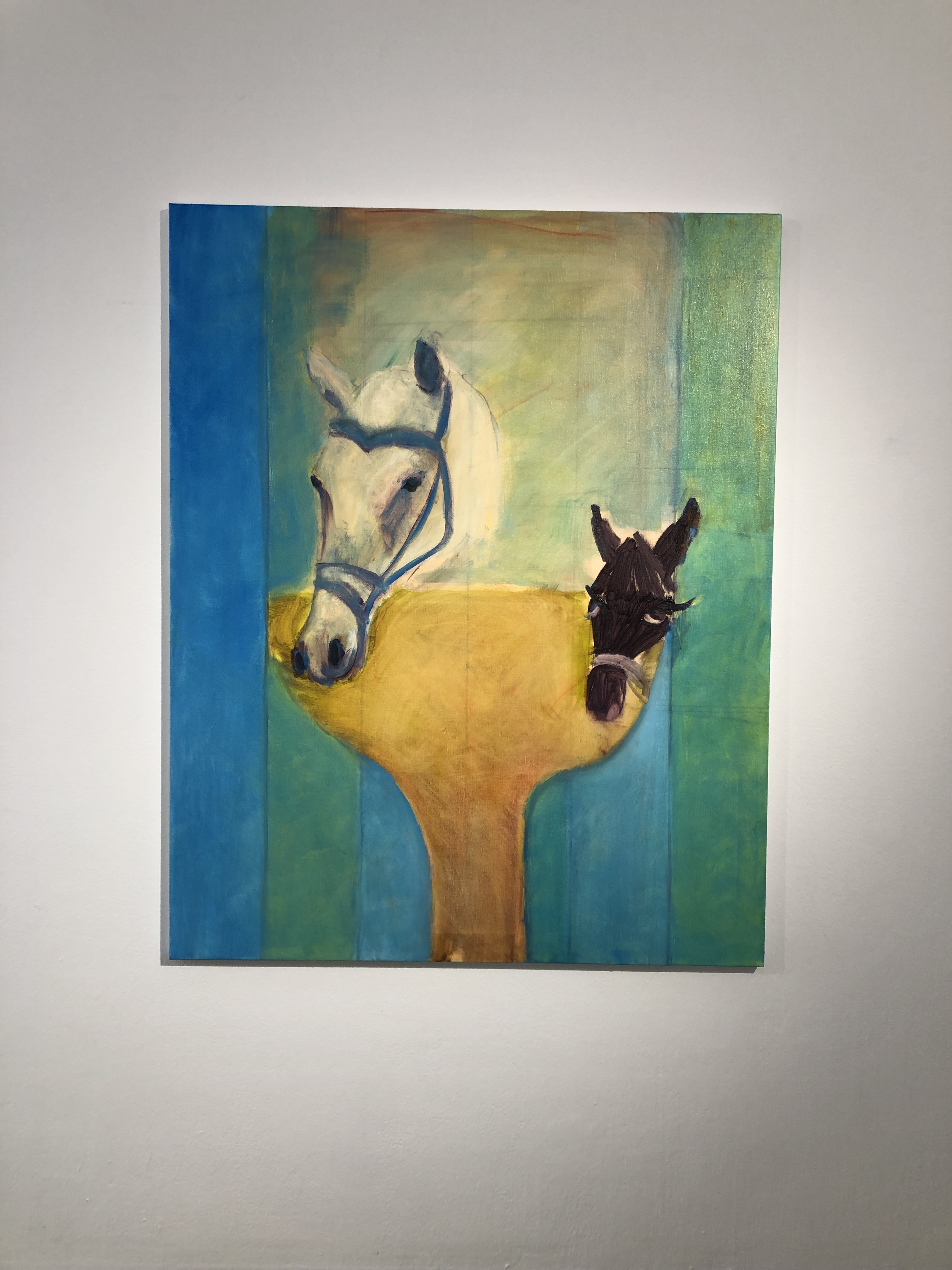
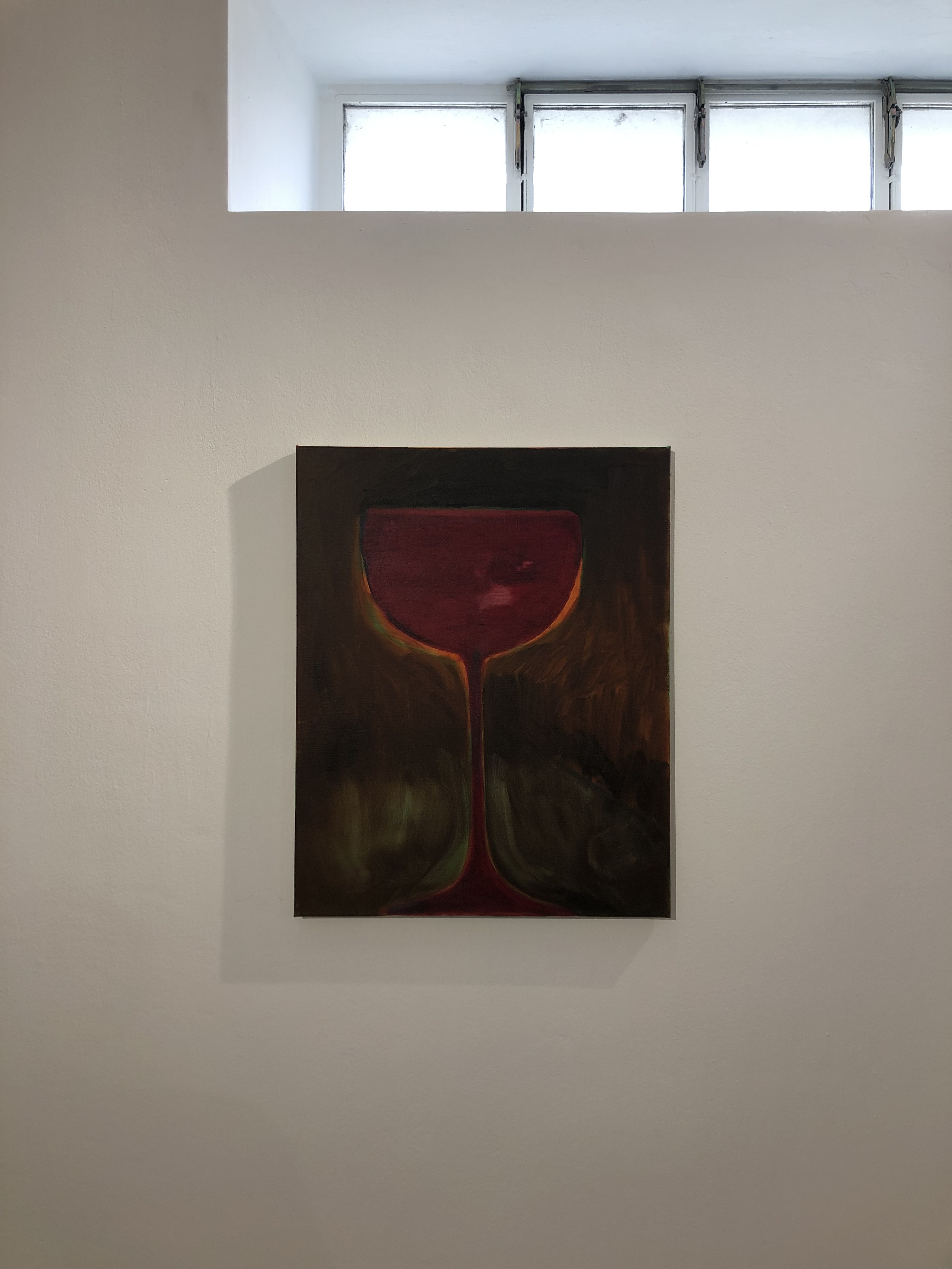
These images reminded me of the past tours that we had taken, the ones that showed the daily functioning of the upper class. “Red stones were a trademark of the imperial family in Vienna” one of our past tour guides informed us. The red in the painting seemed similar to the color of the red wine cup painting. The second painting reminded me of the horse carriages that would carry around the imperial family. The simplistic representation of royalty was on small canvases, no descriptions like other museums that we saw. It was also more spaced out. I felt more comfortable in the presence of these imperial motifs, rather than in the magnificent and intricate palace.
We walked up the stairs to another room, and this room shared the same open, spacious characteristics. There was artwork on the top of the wall that reminded me of Egyptian royalty, because of the gold snakes, the women with gold jewelry, and the man dressed in gold.
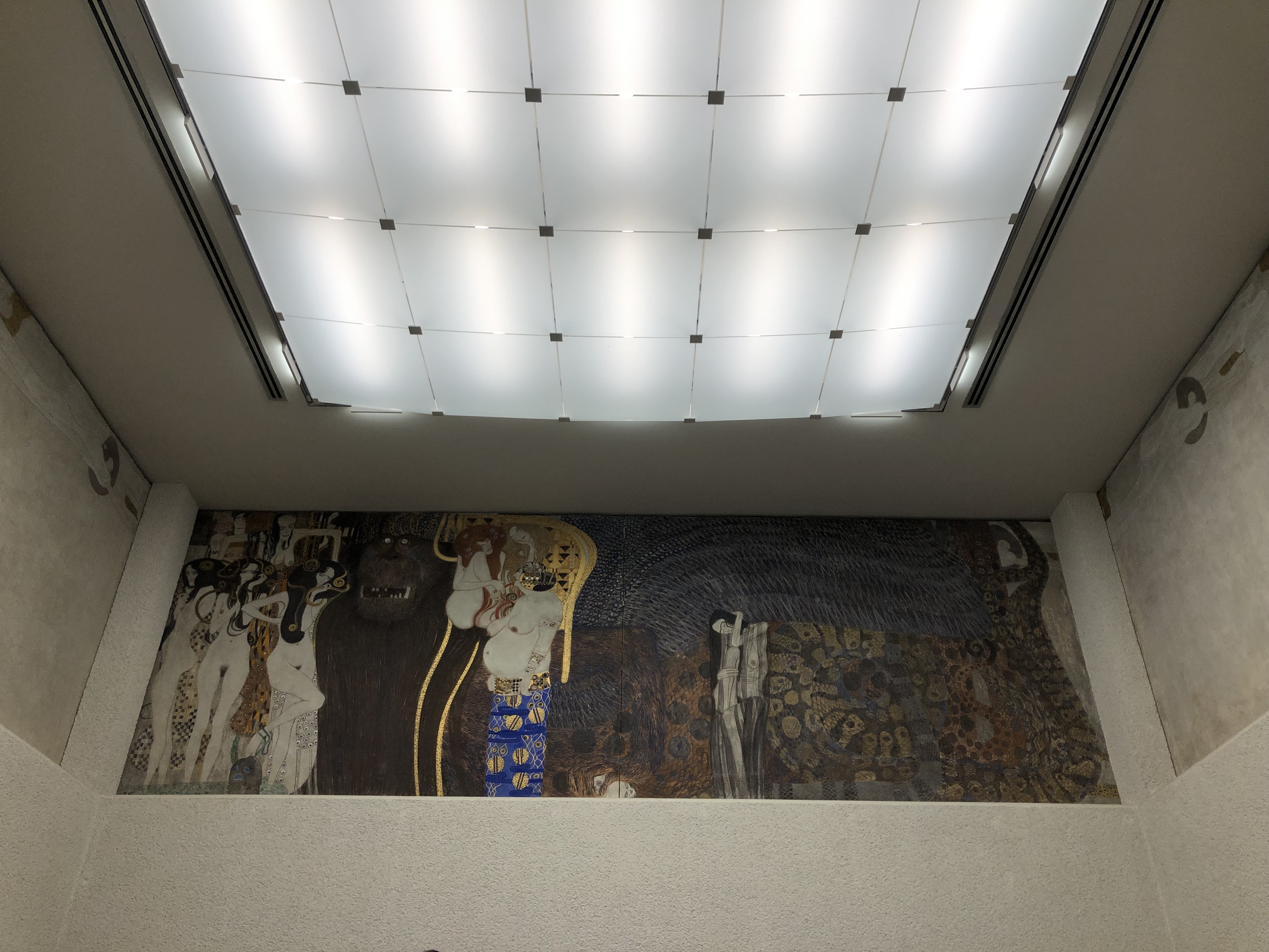
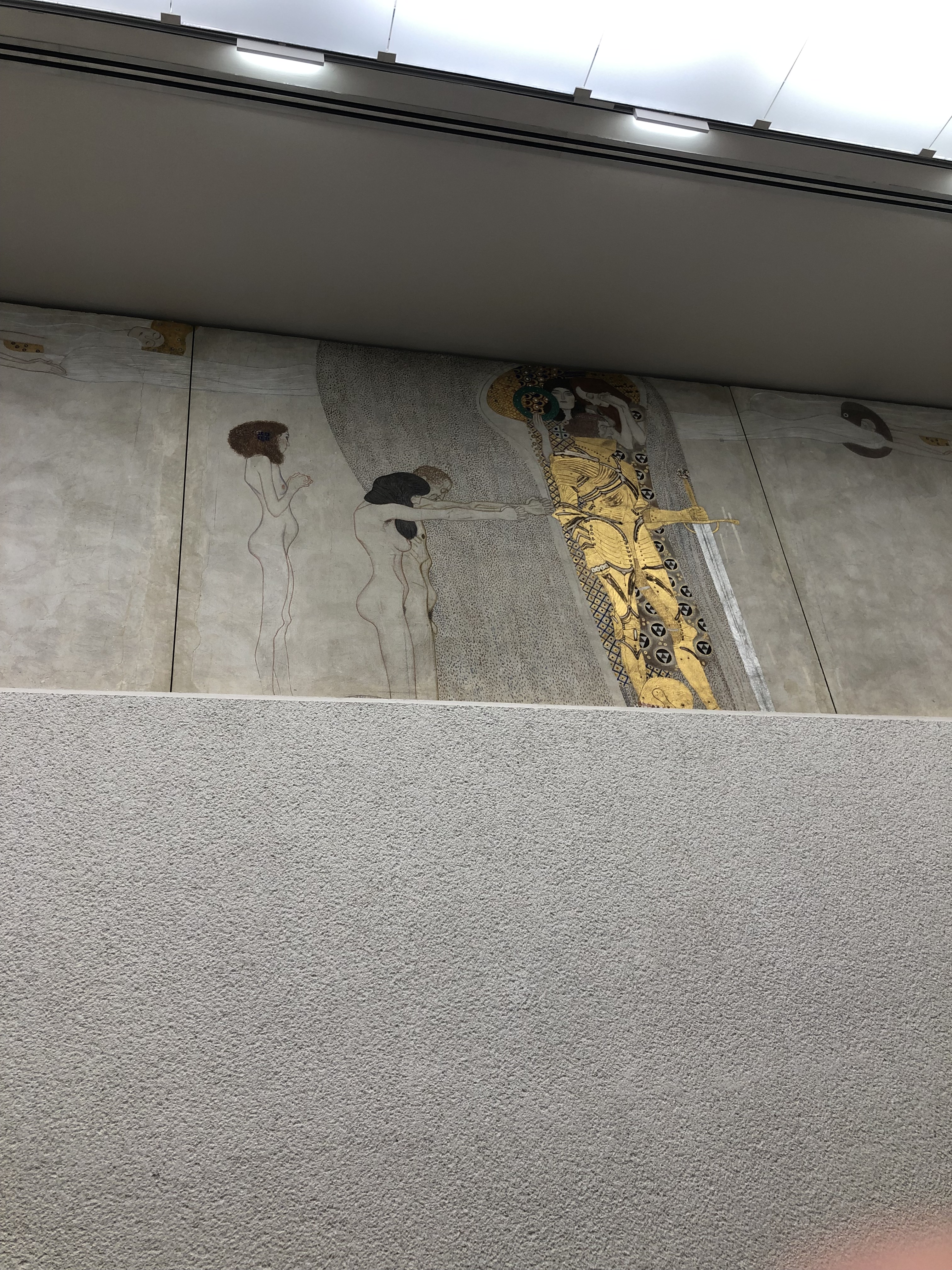
I noticed how there has been a fusion of various different country’s royalty, yet they were made into a simpler presentation. While thinking that it was insanely beautiful, I couldn’t help but wonder how people first felt about it when they first saw it when it was built. I found it interesting that the museum portrayed the “wealthy noble class” from multiple cultures in a simplistic way. The rest of the buildings that we have seen from around this time all represented their wealth and royalty with intricate detailing and specific color schemes, while the succession building disobeyed this trend. According to Sedel, the divergence is a product of both the international project and the move towards functionalism (15-16).
I also remember a class discussion on how all of the royal motifs from the different cultures were at the top of the walls, forcing you to look up to them to enjoy them without anything underneath. Reflecting back, I thought that this was slightly different than the other exhibits that we have been to, and enjoyed the simple representation of a higher class.
The Looshaas bank we visited was different than others that we have seen. The interior was made of smooth red wood and golden railing. I wondered who came to this bank, and asked someone working there if there was a certain type of demographic that came to this bank, since it was in the area of expensive shopping stores. He said that the upper class was drawn to this bank. He added details that there was also an art gallery inside, and that the bank sold real estate that fewer people could afford. This knowledge intrigued me, because again the common theme that we have seen here was extremely beautiful and intricate buildings for the wealthy, rather than more plain and simple.
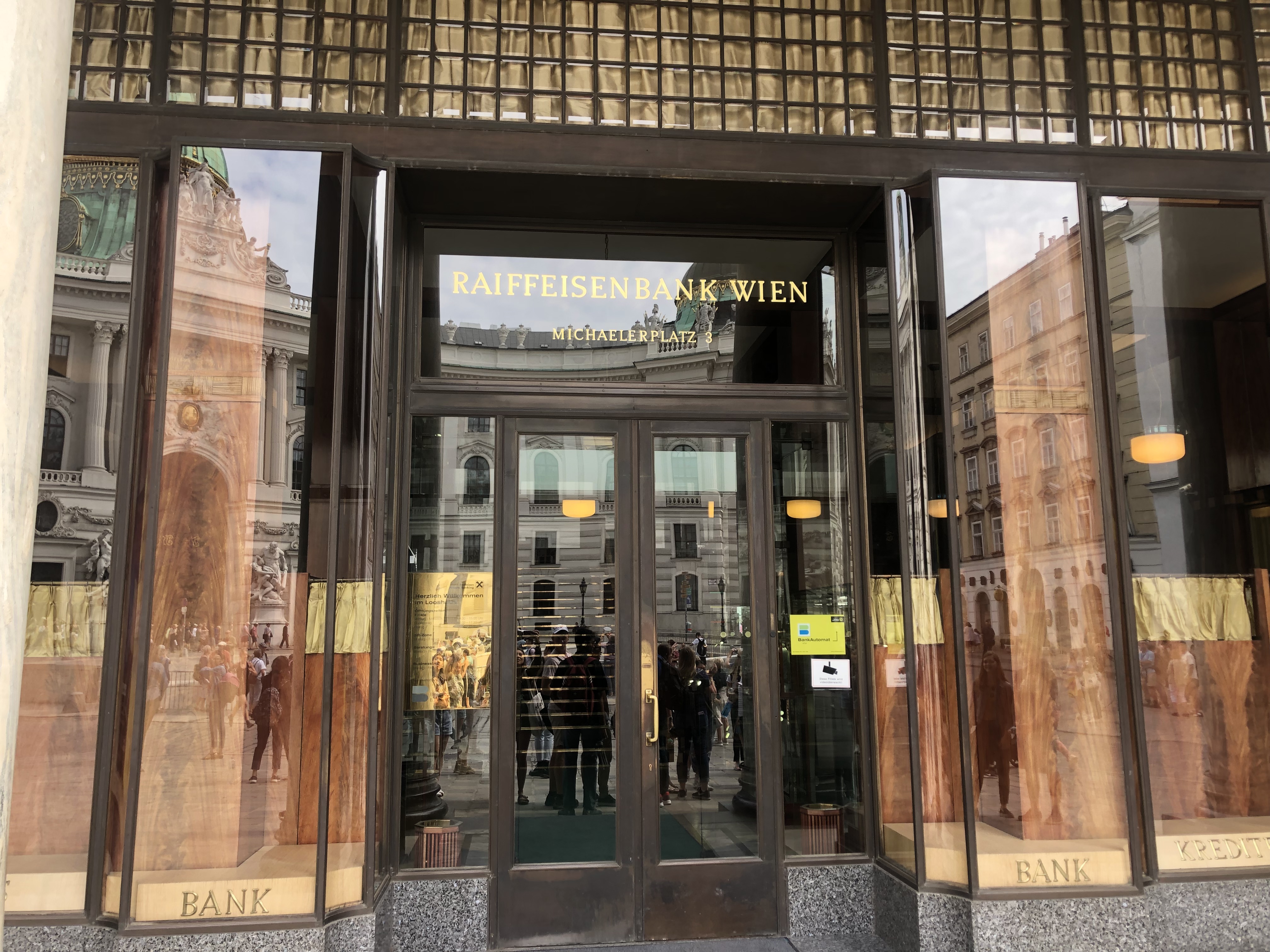
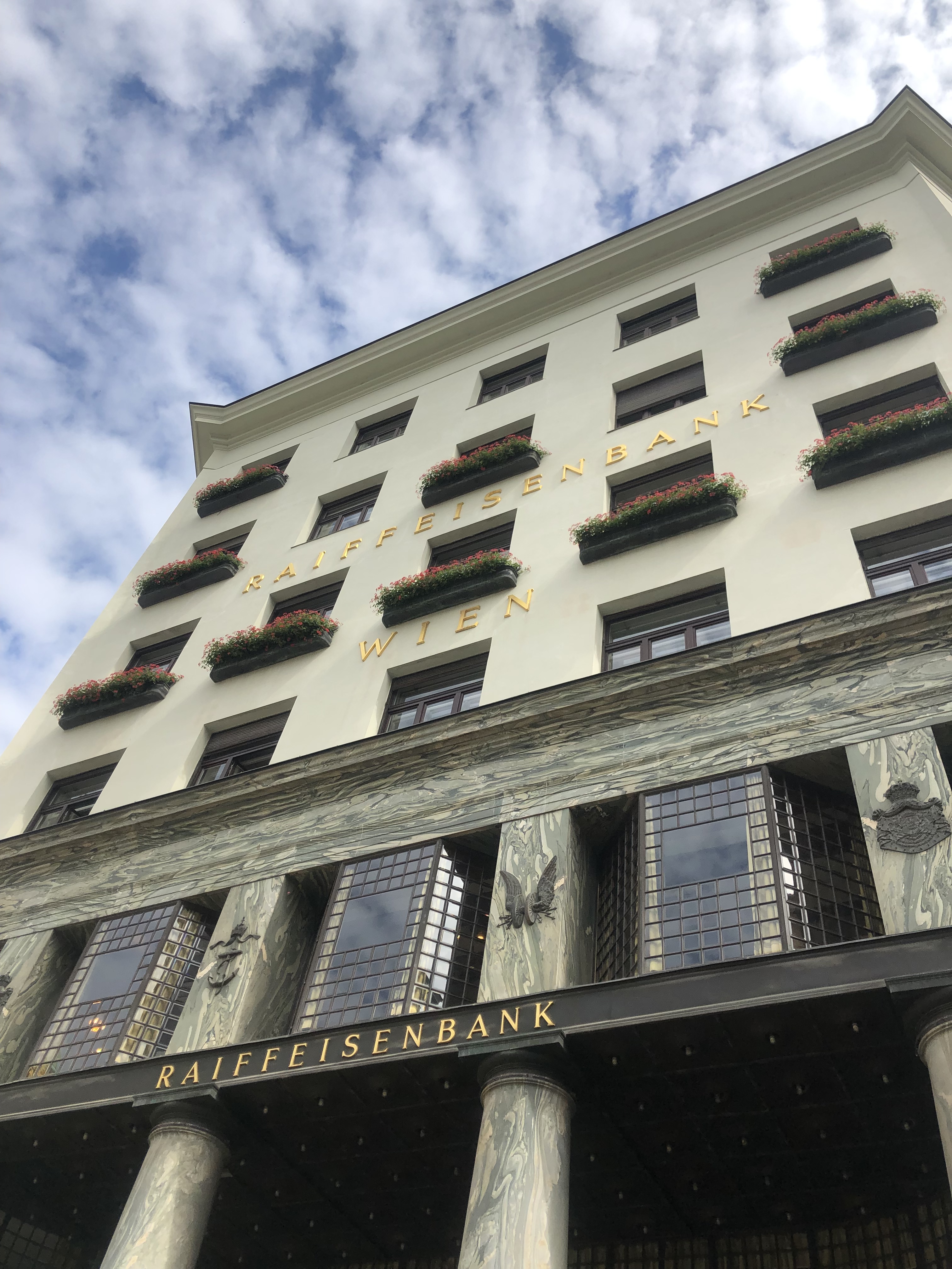
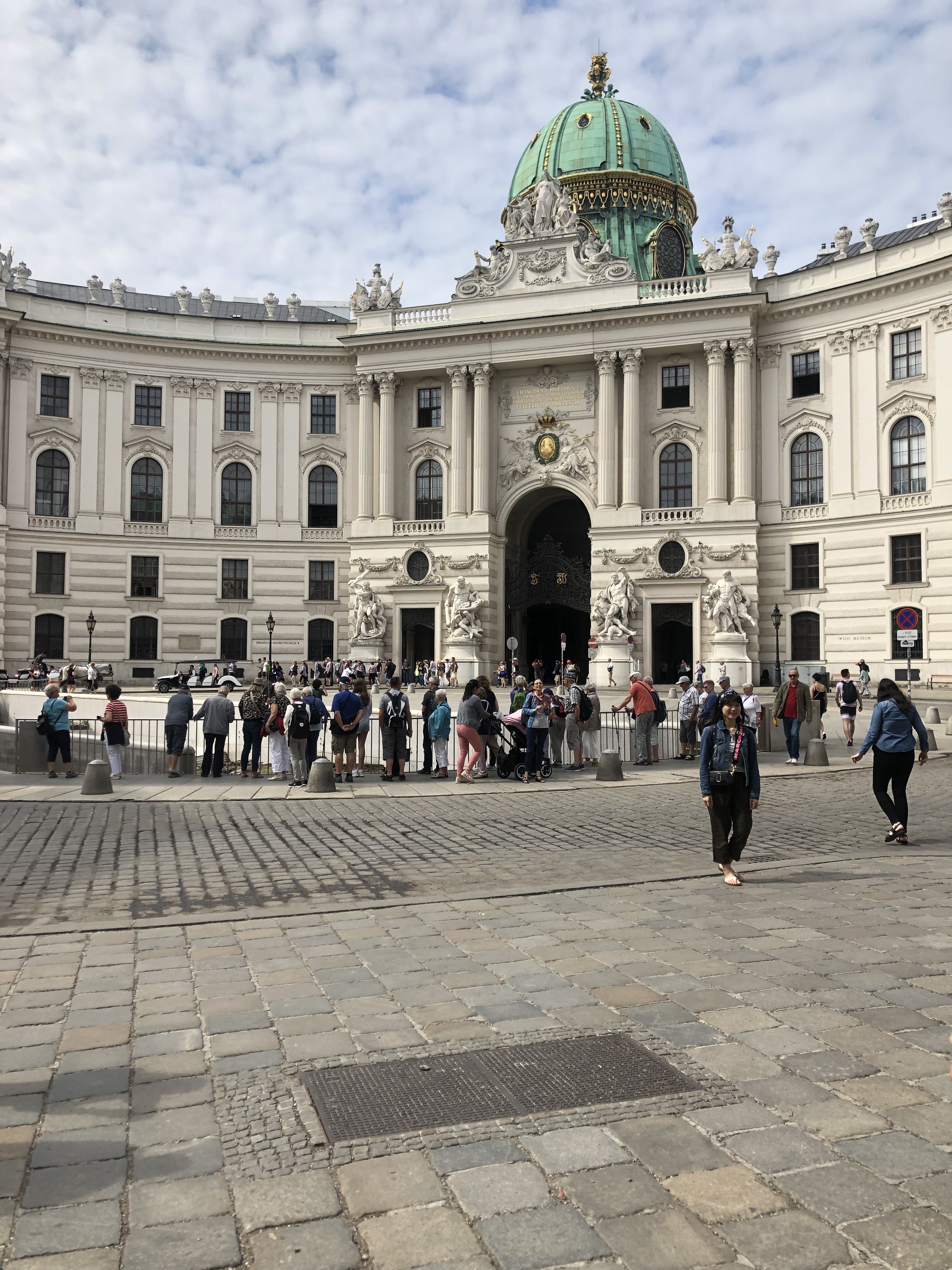
With this new knowledge, I looked outside at the view that someone has from this building. I was curious to see what it would be, and I was not too surprised to see another building with the white, teal, and gold color scheme. It made sense to me that this was the view because of the demographic that the bank attracted.
Sedel, James. Secession: the Vienna Secession – from Temple of Art to Exhibition Hall. Hatje, 1997.
